Người chia sẻ - Được sự ủng hộ nhiệt tình của các bạn về việc lập dự án thiết kế template từ A tới Z nên hôm nay người chia sẻ quyết định bắt tay vào việc thực hiện dự án này luôn. Bài viết này mình chỉ hướng dẫn cho các blogger viết blog trên nền blogspot của google thôi nha. Và tất nhiên là sẽ thiết kế mới 100% template.
Hiển thị các bài đăng có nhãn THỦ THUẬT BLOGSPOT. Hiển thị tất cả bài đăng
Hiển thị các bài đăng có nhãn THỦ THUẬT BLOGSPOT. Hiển thị tất cả bài đăng
Thứ Năm, 23 tháng 1, 2014
Thứ Ba, 21 tháng 1, 2014
Tiện ích các nút Share trượt dọc cho Blogspot (sticky sidebar)
Tiện ích các nút Share trượt dọc cho Blogspot (sticky sidebar)
Đối với những người đang sở hữu web/blog thì công cụ chia sẻ lên mạng xã hội like, tweet... không thể, nó có thể giúp đọc giả chia sẻ bài viết hay làm tăng trafic cho web/blog. Có rất nhiều cách để đặt các tiện ích này, hôm nay namkna chia sẻ cùng các bạn cách bố trí các công cụ hữu ích này theo chiều dọc và với hiệu ứng trượt kế phần main mỗi khi bạn cuộn (scrollbar) chuột xuống phía dưới. Nó giống như dạng các banner quảng cáo trượt dọc 2 bên của blogspot mà ibiet giới thiệu.
Các bạn có thể xem Demo.
Hình ảnh minh họa:

Cách 1: Không sử dụng Javar Scip.
» Bắt đầu thủ thuật1. Đăng nhập vào tài khoản Blogger
2. Vào phần thiết kế (Design)
3. Chọn chỉnh sửa Phần tử trang
4. Chọn Thêm tiện ích (Add Widget) và Thêm đoạn code sau vào:
<style>
/* Fixed Positioned AddThis Toolbox */
.sharing_box_ibiet {
position: fixed;
top: 10%;
right: 0;
border: 3px solid #00EE00;
padding: 5px 5px 1px;
-moz-border-radius: 4px;
-webkit-border-radius: 4px;
border-radius: 4px;
background: #F0FFFF;
width: 60px;
min-height: 345px;
}
.sharing_box_ibiet .item {
width: 50px;
margin: 5px 0 5px 0;
}
.twitter_float iframe
{
width:55px!important;
}
</style>
<!-- SHARING BOX Fixed-Positioned Toolbox -->
<div class='sharing_box_ibiet'>
<div style='text-align:center; margin-top:5px'>
<img alt='Share Emphasis' height='46px' src='https://blogger.googleusercontent.com/img/b/R29vZ2xl/AVvXsEh9llomtXMX4Xz4JsO38UA0S2fUsMa6CXZ-NGR3KNjoTL7zGa8cSJsikvWiLPiiCs_BlRV2DgS_UMvfC9h2GOYhiHP0qK9mOnX_v0YC6hDYvBLr6xdpZAtv-nE3AclnJlab7hm3mC7nxWOc/s1600/obtenir-par-poste-icone-5533-48-+-namkna-blogspot-com.png' width='56px'/>
</div>
<!-- TWITTER -->
<div class='item twitter_float' style='margin-left:3px'>
<a class='twitter-share-button' data-count='vertical' data-lang='en' href='https://twitter.com/share'>Tweet</a>
</div>

<!-- FACEBOOK -->
<div class='item' style='margin-left:3px'>
<div class='fb-like' data-font='verdana' data-layout='box_count' data-send='false' data-show-faces='true' data-width='44'></div>
<div id='fb-root'></div>
</div>
<!-- G+ -->
<div class='item' style='margin-left:5px'>
<!-- Place this tag where you want the +1 button to render -->
<g:plusone size='tall'></g:plusone>
</div>
<!-- OTHERSHARE -->
<div class='item' style='margin-left:5px'>
<!-- AddThis Button BEGIN -->
<div class='addthis_toolbox addthis_default_style '>
<a class='addthis_counter'></a>
</div>
<!-- AddThis Button END -->
</div>
</div>
<!-- FAST SHARING SCRIPT -->
<!-- TWITTER SCRIPT -->
<script>!function(d,s,id){var js,fjs=d.getElementsByTagName(s)[0];if(!d.getElementById(id)){js=d.createElement(s);js.id=id;js.src="//platform.twitter.com/widgets.js";fjs.parentNode.insertBefore(js,fjs);}}(document,"script","twitter-wjs");</script>
<script>(function(d, s, id) {
  var js, fjs = d.getElementsByTagName(s)[0];
  if (d.getElementById(id)) return;
  js = d.createElement(s); js.id = id;
  js.src = "//connect.facebook.net/en_GB/all.js#xfbml=1";
  fjs.parentNode.insertBefore(js, fjs);
}(document, 'script', 'facebook-jssdk'));</script>
<!-- G+ SCRIPT -->
<!-- Place this render call where appropriate -->
<script type='text/javascript'>gapi.plusone.go();</script>
<!-- STUMBLEUPON SCRIPT -->
<!-- Place this snippet wherever appropriate -->
<script type='text/javascript'>
 (function() {
     var li = document.createElement('script'); li.type = 'text/javascript'; li.async = true;
      li.src = 'https://platform.stumbleupon.com/1/widgets.js';
      var s = document.getElementsByTagName('script')[0]; s.parentNode.insertBefore(li, s);
 })();
 </script>
<script type="text/javascript" src="http://s7.addthis.com/js/250/addthis_widget.js#pubid=ra-4f660fb932fd0f15"></script>
<!-- AddThis Button END -->
5. Chọn lưu mẫu.6. Tiếp theo chọn Chỉnh sửa HTML và thêm đoạn code bên dưới vào trước thẻ </head>
<script src='http://apis.google.com/js/plusone.js' type='text/javascript'> {lang: 'en-US'} </script>8. Cuối cùng Lưu mẫu lại.
Cách 2: sử dụng JQuery.
» Bắt đầu thủ thuật
1. Đăng nhập vào tài khoản Blogger
2. Vào phần thiết kế (Design)
3. Chọn chỉnh sửa HTML (Edit HTML)
4. Chọn mở rộng mẫu tiện ích (Expand Widget Templates)
5. Chèn code bên dưới vào sau thẻ <head>
<script src="http://dl.dropbox.com/u/70549761/jQuery/namkna-blogspot-com/jquery.min.v1.4.1.js" type="text/javascript"></script>
<script src="http://dl.dropbox.com/u/70549761/jQuery/namkna-blogspot-com/stickysidebar.jquery.js" type="text/javascript"></script>
<script type="text/javascript">
$(document).ready(function () {
$('#share-buttons').stickySidebar({speed: 300, constrain: true})
});
</script>

<style>
#share-buttons {
background:  #fff;
border: 1px solid #ccc;
margin-left: -82px;
padding: 8px;
position: absolute;
-moz-border-radius: 6px;
-webkit-border-radius: 6px;
-goog-ms-border-radius: 6px;
border-radius: 6px;
}
</style>
- Lưu ý: Các bạn nên thể Download 2 File Js trên về Tại Đây và upload lên host riêng để dùng lâu dài.
6. Bây giờ bạn tìm đến dòng code bên dưới hoặc tương tự (do đặc điểm cấu tạo của mỗi blog nên có chút khác nhau nhỏ).<div class='post-header-line-1'/>7. Tiếp theo bạn chèn code bên dưới vào sau code vừa tìm được
<div id='share-buttons'>
<div class='twitter scount'>
<a
 class='twitter-share-button' data-count='vertical' data-text='List Only
 Post Titles On Blogger Labels Pages'
data-url='http://www.spiceupyourblog.com/2009/12/how-to-make-your-labels-search-and.html'
 data-via='paulcrowepro'
href='http://twitter.com/share'>Tweet</a><script
src='http://platform.twitter.com/widgets.js' type='text/javascript'/>
</div>

<div class='facebook scount'>
<fb:like
 font=''
href='http://www.spiceupyourblog.com/2009/12/how-to-make-your-labels-search-and.html'
 layout='box_count' send='false' show_faces='false' width='50'/>
</div>

<div class='stumble scount'>
<script src='http://www.stumbleupon.com/hostedbadge.php?s=5'/>
</div>

<div class='gplus scount'>
<script src='https://apis.google.com/js/plusone.js' type='text/javascript'/><g:plusone size='tall'/>
</div>
</div>
Ở trên mình chỉ đưa một số công cụ phổ biến bạn có thể dựa vào đó để thay đổi bổ sung hoặc xóa bớt cho phù hợp với site của bạn.
8. Cuối cùng Lưu mẫu lại.
Chúc thành công!
8. Cuối cùng Lưu mẫu lại.
Chúc thành công!
Bật Chức Năng Google AdSence Trong Blogspot
Tại thời điểm hiện Blogspot ở việt nam sử dụng tiếng việt không được bật chức năng Google AdSence.
Hướng Dẫn Đăng Ký Google Adsence Cho Blogspot
Mình cũng không biết lý do tại sao nữa (Google gét IP từ việt nam ??) nhưng chức năng này bị giới hạn không hiển thị nếu bạn đăng ký blogspot bằng tiếng việt thông qua google.com.vn.

 Tại đây mình sẽ hướng dẫn cách kích hoạt Google AdSence cho blogspot cách đơn giản
Kích hoạt Google AdSense làm gì?
Đơn giản để những người dùng Blogger kiếm tiền bằng cách hiển thị các quảng cáo Google được nhắm mục tiêu trên blog của mình.
Các bước kích hoạt Google AdSense:
Bước 1: Vào quản lý blog Tiếp đến vào "Cài đặt" chọn "Ngôn ngữ và định dạng" .
Mặc định khi tạo blogspot thì ngôn ngữ được để là Tiếng Việt nếu bạn sử dụng google.com.vn còn bây giờ chúng ta cần là chuyển chọn sang Tiếng Anh (hoa kỳ).
Ấn lưu cài đặt phía bên góc phải để hoàn thành.

Bước 2: Sau khi xong bước này chọn "Blog của tôi" chữ to nhất nằm phía trên góc trái nhé
Phần này hiển thị tất cả blogspot của bạn quản lý, lại tiếp tục chuyển ngôn ngũ sang định dạng ngôn ngữ Tiếng Anh (hoa kỳ) nhé, cái này tự động chuyển không có nút lưu nên đừng mất công tìm kiếm nút lưu.

Và đấy hình này là sau khi dịch chuyển ngôn ngữ sang Tiếng Anh (hoa kỳ)

Bước 4: Quay lại blogspot.

Đã nhìn thấy phần "Earnings" dịch tiếng việt là "Doanh thu".
Bây giờ muốn dùng Tiếng Việt thì tiếp tục vào cài đặt và chỉnh về ngôn ngữ từ tiếng anh sang tiếng việt để dễ dàng sử dụng.
Như vậy là đã kích hoạt phần Google AdSense thành công
Ghi chú :
Nếu từ đầu tạo blogspot bằng cách vào google.com thì sẽ có luôn đỡ phải làm các bước trên.
Mình cũng không biết lý do tại sao nữa (Google gét IP từ việt nam ??) nhưng chức năng này bị giới hạn không hiển thị nếu bạn đăng ký blogspot bằng tiếng việt thông qua google.com.vn.
Kích hoạt Google AdSense làm gì?
Đơn giản để những người dùng Blogger kiếm tiền bằng cách hiển thị các quảng cáo Google được nhắm mục tiêu trên blog của mình.
Các bước kích hoạt Google AdSense:
Bước 1: Vào quản lý blog Tiếp đến vào "Cài đặt" chọn "Ngôn ngữ và định dạng" .
Mặc định khi tạo blogspot thì ngôn ngữ được để là Tiếng Việt nếu bạn sử dụng google.com.vn còn bây giờ chúng ta cần là chuyển chọn sang Tiếng Anh (hoa kỳ).
Ấn lưu cài đặt phía bên góc phải để hoàn thành.
Bước 2: Sau khi xong bước này chọn "Blog của tôi" chữ to nhất nằm phía trên góc trái nhé
Phần này hiển thị tất cả blogspot của bạn quản lý, lại tiếp tục chuyển ngôn ngũ sang định dạng ngôn ngữ Tiếng Anh (hoa kỳ) nhé, cái này tự động chuyển không có nút lưu nên đừng mất công tìm kiếm nút lưu.
Và đấy hình này là sau khi dịch chuyển ngôn ngữ sang Tiếng Anh (hoa kỳ)
Bước 4: Quay lại blogspot.
Đã nhìn thấy phần "Earnings" dịch tiếng việt là "Doanh thu".
Bây giờ muốn dùng Tiếng Việt thì tiếp tục vào cài đặt và chỉnh về ngôn ngữ từ tiếng anh sang tiếng việt để dễ dàng sử dụng.
Như vậy là đã kích hoạt phần Google AdSense thành công
Ghi chú :
Nếu từ đầu tạo blogspot bằng cách vào google.com thì sẽ có luôn đỡ phải làm các bước trên.
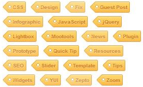
Trang Trí Phần Tags (nhãn) Đẹp Cho Blogger
Ibiet - Chia sẽ với các bạn cách trang trí phần Tags (nhãn) đẹp cho Blogger

Trang trí phần Nhãn (Tags) đẹp luôn là một trong những mối quan tâm của các Blogger. Bài viết này giới thiệu với bạn một trong những cách làm đẹp thêm cho blog của bạn.
Mẫu 1:

Bước 1: Bạn vào Phần tử trang -> Thêm tiện ích/ HTML -> Thêm Tags theo hướng dẫn hình ảnh bên dưới.
.png)
Bước 2: Bạn vào phần chỉnh sửa HTML -> Ctrl +F -> Tìm đoạn thẻ ]]></b:skin>
Thêm vào trước nó đoạn code sau:
.label-size{ margin:0 2px 6px 0; padding: 3px; text-transform: uppercase; border: solid 1px #C6C6C6; border-radius: 3px; float:left; text-decoration:none; font-size:10px; color:#666; } .label-size:hover { border:1px solid #6BB5FF; text-decoration: none; -moz-transition: all 0.5s ease-out; -o-transition: all 0.5s ease-out; -webkit-transition: all 0.5s ease-out; -ms-transition: all 0.5s ease-out; transition: all 0.5s ease-out; -moz-transform: rotate(7deg); -o-transform: rotate(7deg); -webkit-transform: rotate(7deg); -ms-transform: rotate(7deg); transform: rotate(7deg); filter: progid:DXImageTransform.Microsoft.Matrix( M11=0.9961946980917455, M12=-0.08715574274765817, M21=0.08715574274765817, M22=0.9961946980917455, sizingMethod='auto expand'); zoom: 1; } .label-size a { text-transform: uppercase; float:left; text-decoration: none; } .label-size a:hover { text-decoration: none; }Bước 3:Lưu mẫu.
Lưu ý: Thay đổi các thông số màu sắc tùy ý, tham khảo Bảng Mã Màu Thập Lục Đẹp Cho Blogger
Mẫu 2:
Thay code ở bước 2
.label-size {
float: left;
margin: 0 0 7px 20px;
position: relative;
font-family: 'Helvetica Neue', Helvetica, Arial, sans-serif;
font-size: 0.75em;
font-weight: bold;
text-decoration: none;
color: #996633;
text-shadow: 0px 1px 0px rgba(255,255,255,.4);
padding: 0.417em 0.417em 0.417em 0.917em;
border-top: 1px solid #d99d38;
border-right: 1px solid #d99d38;
border-bottom: 1px solid #d99d38;
-webkit-border-radius: 0 0.25em 0.25em 0;
-moz-border-radius: 0 0.25em 0.25em 0;
border-radius: 0 0.25em 0.25em 0;
background-image: -webkit-linear-gradient(top, rgb(254, 218, 113), rgb(254, 186, 71));
background-image: -moz-linear-gradient(top, rgb(254, 218, 113), rgb(254, 186, 71));
background-image: -o-linear-gradient(top, rgb(254, 218, 113), rgb(254, 186, 71));
background-image: -ms-linear-gradient(top, rgb(254, 218, 113), rgb(254, 186, 71));
background-image: linear-gradient(top, rgb(254, 218, 113), rgb(254, 186, 71));
filter: progid:DXImageTransform.Microsoft.gradient(GradientType=0,StartColorStr='#feda71', EndColorStr='#feba47');
-webkit-box-shadow: inset 0 1px 0 #faeaba,
0 1px 1px rgba(0,0,0,.1);
-moz-box-shadow: inset 0 1px 0 #faeaba,
0 1px 1px rgba(0,0,0,.1);
box-shadow: inset 0 1px 0 #faeaba,
0 1px 1px rgba(0,0,0,.1);
z-index: 1;
}
.label-size:before {
content: '';
width: 1.30em;
height: 1.39em;
background-image: -webkit-linear-gradient(left top, rgb(254, 218, 113), rgb(254, 186, 71));
background-image: -moz-linear-gradient(left top, rgb(254, 218, 113), rgb(254, 186, 71));
background-image: -o-linear-gradient(left top, rgb(254, 218, 113), rgb(254, 186, 71));
background-image: -ms-linear-gradient(left top, rgb(254, 218, 113), rgb(254, 186, 71));
background-image: linear-gradient(left top, rgb(254, 218, 113), rgb(254, 186, 71));
filter: progid:DXImageTransform.Microsoft.gradient(GradientType=1,StartColorStr='#feda71', EndColorStr='#feba47');
position: absolute;
left: -0.69em;
top: .2em;
-webkit-transform: rotate(45deg);
-moz-transform: rotate(45deg);
-o-transform: rotate(45deg);
transform: rotate(45deg);
border-left: 1px solid #d99d38;
border-bottom: 1px solid #d99d38;
-webkit-border-radius: 0 0 0 0.25em;
-moz-border-radius: 0 0 0 0.25em;
border-radius: 0 0 0 0.25em;
z-index: 1;
}
.label-size:after {
content: '';
width: 0.5em;
height: 0.5em;
background: #fff;
-webkit-border-radius: 4.167em;
-moz-border-radius: 4.167em;
border-radius: 4.167em;
border: 1px solid #d99d38;
-webkit-box-shadow: 0 1px 0 #faeaba;
-moz-box-shadow: 0 1px 0 #faeaba;
box-shadow: 0 1px 0 #faeaba;
position: absolute;
top: 0.667em;
left: -0.083em;
z-index: 9999;
}
#Label1 {
height: 210px;
}
.label-size:hover {
background-image: -webkit-linear-gradient(top, rgb(254, 225, 141), rgb(254, 200, 108));
background-image: -moz-linear-gradient(top, rgb(254, 225, 141), rgb(254, 200, 108));
background-image: -o-linear-gradient(top, rgb(254, 225, 141), rgb(254, 200, 108));
background-image: -ms-linear-gradient(top, rgb(254, 225, 141), rgb(254, 200, 108));
background-image: linear-gradient(top, rgb(254, 225, 141), rgb(254, 200, 108));
filter: progid:DXImageTransform.Microsoft.gradient(GradientType=0,StartColorStr='#fee18d', EndColorStr='#fec86c');
border-color: #e1b160;
}
.label-size:hover:before {
background-image: -webkit-linear-gradient(left top, rgb(254, 225, 141), rgb(254, 200, 108));
background-image: -moz-linear-gradient(left top, rgb(254, 225, 141), rgb(254, 200, 108));
background-image: -o-linear-gradient(left top, rgb(254, 225, 141), rgb(254, 200, 108));
background-image: -ms-linear-gradient(left top, rgb(254, 225, 141), rgb(254, 200, 108));
background-image: linear-gradient(left top, rgb(254, 225, 141), rgb(254, 200, 108));
filter: progid:DXImageTransform.Microsoft.gradient(GradientType=1,StartColorStr='#fee18d', EndColorStr='#fec86c');
border-color: #e1b160;}
Mẫu 3:
.PNG)
Thay code ở bước 2
#Label1 a{
outline:1px dotted #FEB380;border: 1px rgba(0,0,0,0.2) solid;padding: 6px 8px 6px 14px;text-decoration:none;
color:black;#f8f8f8-space: nowrap;
font-family: arial,serif;text-transform:capitalize;
font-size: 12px;font-weight: bold;
position: relative !important;background: #aa00ff;
-moz-opacity:0.75;
-khtml-opacity:0.75;opacity:0.75;
filter:alpha(opacity:75%);
float:left;padding: 4px 3px;
margin: 0 5px 5px 0;
border-radius:4px 4px; -moz-border-radius:8px 4px 4px 4px; -khtml-border-radius:4px 4px 4px 4px; -webkit-border-radius:4px 4px 4px 4px; border-radius:4px 4px 4px 4px;
}
#Label1 a:hover {
-moz-opacity:1;
-khtml-opacity:1;
opacity:1;
background:#A55A27;color:#f8f8f8;
-webkit-transition:all ease-in-out .5s;
-moz-transition:all ease-in-out .5s;
-o-transition:all ease-in-out .5s;
transition:all ease-in-out .5s;
}
#Label1 a:active {
background:#B24700;color:#80FFFE;
-webkit-transition:all linear .5s;
-moz-transition:all linear .5s;
-o-transition:all linear .5s;transition:all linear .5s;
}
Mẫu 4:

Thay code ở bước 2
#Label1 a{float:left;
height:18px;
line-height:18px;
position:relative;
font-size:12px;
margin-bottom: 9px;
margin-left:10px;
padding:5px;
background: rgb(69,72,77); /* Old browsers */
background: -moz-linear-gradient(top, rgba(69,72,77,1) 0%, rgba(0,0,0,1) 100%); /* FF3.6+ */
background: -webkit-gradient(linear, left top, left bottom, color-stop(0%,rgba(69,72,77,1)), color-stop(100%,rgba(0,0,0,1))); /* Chrome,Safari4+ */
background: -webkit-linear-gradient(top, rgba(69,72,77,1) 0%,rgba(0,0,0,1) 100%); /* Chrome10+,Safari5.1+ */
background: -o-linear-gradient(top, rgba(69,72,77,1) 0%,rgba(0,0,0,1) 100%); /* Opera 11.10+ */
background: -ms-linear-gradient(top, rgba(69,72,77,1) 0%,rgba(0,0,0,1) 100%); /* IE10+ */
background: linear-gradient(to bottom, rgba(69,72,77,1) 0%,rgba(0,0,0,1) 100%); /* W3C */
filter: progid:DXImageTransform.Microsoft.gradient( startColorstr='#45484d', endColorstr='#000000',GradientType=0 ); /* IE6-9 */
color:#fff;
text-decoration:none;
-moz-border-radius:4px;
-webkit-border-radius:4px;
border-radius:4px;}
#Label1 a:hover{fbackground: rgb(73,192,240); /* Old browsers */
background: -moz-linear-gradient(top, rgba(73,192,240,1) 0%, rgba(44,175,227,1) 100%); /* FF3.6+ */
background: -webkit-gradient(linear, left top, left bottom, color-stop(0%,rgba(73,192,240,1)), color-stop(100%,rgba(44,175,227,1))); /* Chrome,Safari4+ */
background: -webkit-linear-gradient(top, rgba(73,192,240,1) 0%,rgba(44,175,227,1) 100%); /* Chrome10+,Safari5.1+ */
background: -o-linear-gradient(top, rgba(73,192,240,1) 0%,rgba(44,175,227,1) 100%); /* Opera 11.10+ */
background: -ms-linear-gradient(top, rgba(73,192,240,1) 0%,rgba(44,175,227,1) 100%); /* IE10+ */
background: linear-gradient(to bottom, rgba(73,192,240,1) 0%,rgba(44,175,227,1) 100%); /* W3C */
filter: progid:DXImageTransform.Microsoft.gradient( startColorstr='#49c0f0', endColorstr='#2cafe3',GradientType=0 ); /* IE6-9 */}
.label-size{line-height:1.5;align:left;}
.h2head-text {margin:-40px 10px 8px 55px;color:#666666;font-family:arial;font-size:13px;}
#Label1{width:320px;;border-bottom-width: 1px;
border-bottom-style: solid;
border-bottom-color: #D8D8D8;}
Read more: http://blog.atsvn.net/2013/06/tuy-chinh-tien-ich-nhan-label-widget.html#ixzz2ps9SFxai
Lưu ý: Thay đổi các thông số màu sắc tùy ý, tham khảo Bảng Mã Màu Thập Lục Đẹp Cho Blogger
Đăng ký:
Bài đăng (Atom)


![[ Miễn phí ] Học thử chương trình thiết kế Đồ họa 2D - Dành cho người mới bắt đầu](http://sukienhay.com/images/avatar/events/c3f390a3142d233c5d13f3a4.jpg)


